Style Guide
Use this page as a reference for content entry; below are best practices for setting type, recommendations on creating dynamic layouts, and general instructions for bringing the JFI site to life.
Layout
By default, content on new posts and pages will flow left-aligned in a single column.
The block editor (a.k.a. the Gutenberg editor) provides plenty of block types for content ranging from simple text to images, lists, quotes, etc. Among the available blocks are two of special importance: the Group and Columns blocks.
Group blocks create a container that allows for text color, background color, and border styles to be modified.
When content is grouped, the spacing between the group’s elements is slightly reduced to visually tie the elements together.
Groups can include all other blocks — headers included.
Columns provide another dynamic grouping component.
Columns can be added through the default editor flow (pressing the ‘+’ icon or typing ‘/’ on a new line.
Columns (and groups, too!) can also be created by selecting two or more elements and then clicking the left-most ‘Change type…’ icon in the panel that appears. This icon shows two overlapping squares.
Groups can be added inside of columns, as well. This standard paragraph item has been ‘grouped’ by itself to allow for a background color to be added.
To group a single item, select the block and use the triple-dot icon to select ‘Group’ in the panel that appears.
Columns can be reordered by selecting a single column and using the left/right arrows to modify the existing order:
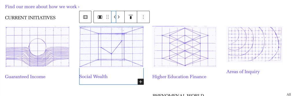
When columns are placed on a page, the user is prompted to select the number of columns and their relative widths. These values can be changed once columns are placed and populated, as well. To do so, select an individual column (not the parent column block) and use the ‘Width’ section in the sidebar. Generally, this width should be set to a percentage — the unit can be changed by clicking the small ‘px’ text.

By default, all blocks in the editor will inherit a standard width — this width is limited to prevent long strings of text from exceeding recommended character length and to ensure that images align cleanly.
However, most blocks — not the standard paragraph, though — allow for this width to be controlled. For instance, you can add a header; below is a ‘Large’ H3 heading (more on headings here!).
A Lengthy Test Heading Used to Demonstrate the Controls Editors Have Over Block Widths
When editing a heading element, a pop-up panel appears above the element; among the icons in the toolbar is a stack of three horizontal lines. Clicking it expands a sub-menu with three options: ‘None’, ‘Wide width’, and ‘Full width’. Below is the same header as before but changed from ‘None’ to ‘Wide width’.
A Lengthy Test Heading Used to Demonstrate the Controls Editors Have Over Block Widths
The ‘Full width’ option eliminates all left and right margins — this option should be used sparingly, if at all, as it will cause the block contents to run to the ends of the screen with no buffers.
Typography
H1 — Heading 1
This heading style should generally be avoided — websites are most accessible when there is only one H1 element on each page, and the page templates already have the H1 coded into them (even if sometimes hidden).
H2 — Heading 2
H2 headings are used to mark primary sections on a page. They always appear upper-case and often have a top border.
Section Headers
In the editor, there is a ‘Top Border’ style in the right-side panel when adding or editing a header item. The site leverages H2 headers with the ‘Top Border’ style to create consistent and stark separations between sections (as used above).
H3 — Heading 3
The H3 heading is set in Melior and at the same size as the site’s body content. It is used for the post card titles to establish better accessibility for visitors using screen-readers or other plain-text viewers.
In specific instances (i.e. the text at the top of the ‘Our Team’ page or the featured event on the ‘News’ page), larger hero text is needed.
H3 headings are used in those instances with the additional selection of “Large (H3 only)” from the right-side editor panel.
H4 — Heading 4
The H4 heading uses the site’s sans-serif typeface, Founders Grotesk) set in the same size the body content. It can be used within post content to mark sub-sections and is also seen on the ‘People’ cards as the style rendering their ‘title’ beneath their name.
H5 — Heading 5
H5 is not a primary block editor element — however, there may be select instances where this text styling is appropriate per the discretion of the editor. This style matches the metadata seen at the top of the post cards.
H6 — Heading 6
Like the H5 heading, H6 not intended to be used frequently — it matches the type style used for image captions/credits.